How to Use WCAG Reporting Word Templates
Accessible Reporting Templates
About
The Evaluation Unit developed reporting templates that meet accessibility requirements. This article provides a high-level overview on how to use them to adhere to the WCAG standards.
Template Locations
Template Locations
- Template with Content - These templates include content to help you get started, such as a cover page, table of contents and more depending on the template you use.
- WCAG Template Folder on the Evaluation Unit SharePoint Site.
- Eval Unit Custom Styles - these are WCAG compliant styles ready to save to your local workspace for quick access.
- Word Styles Folder on the Evaluation Unit SharePoint Site
- Microsoft Quick Styles - this is a unique location for each user mapped to your local drive.
- C:\Users\[user name]\AppData\Roaming\Microsoft\QuickStyles
Instructions
Instructions
Initial Setup
- Open the Eval Unit Styles Custom Styles folder
- Copy all styles in this folder to your Microsoft Quick Styles folder
Perform the initial setup steps in File Explorer, not through SharePoint in a web browser.
Ongoing Use
To select or change between standard styles:
- Open an empty or existing Word document
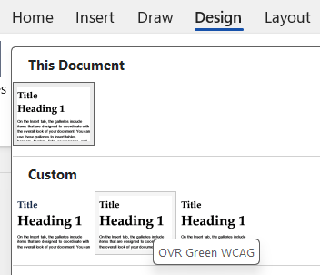
- Navigate to the Design menu
- Expand document formatting pane to see all options
- Hover your mouse over the custom styles
- Select on the desired style
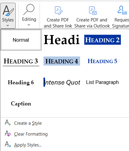
Styles
Styles
Styles provide a standard for document formatting. When creating content in a report, it is recommended to not manually apply formatting as this may cause excessive rework during document finalization, depending on length and complexity of the report. To modify formatting to appear differently, modify using the style properties instead of making changes directly to the document text. For guidance, please see Customize or Create New Styles.
Be aware that when changing styles in documents, some manual changes may need to be applied for page footer colors and Heading 1 based on location and length of the document's title.
Headings
Headings
How These Are Read by Screen Readers
Screen readers use headings like news headlines. They read page headings first to understand what the content is about and to jump directly to the section they want - just like scanning headlines in a newspaper.

Importance of Heading 1
Unlike default Word styles that use a Title heading style for the title and Heading 1 for the content in the main body of the report, an accessible document title is Heading 1.
There are two ways of working to apply Heading 1 as the document Title depending on the type of document you are creating.

Documents With a Cover Page
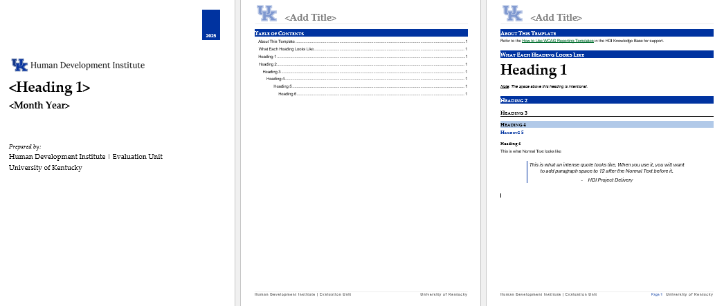
A cover page is used for formal reports and is often followed by a table of contents. For this type of report, Heading 1 is the title on the cover page.
Documents Without a Cover Page
A simple document does not require a cover page. For these document, Heading 1 should be used as the title on the first page of the document only.
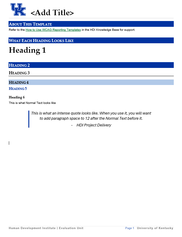
How to Use Heading 1 Correctly
- For documents with a cover page, Heading 1 should be applied to the title on the cover page. The title shown in the header section, which is the top section of a word document that is used to apply the same header/footer throughout every page of a multi-page document), is not Heading 1.
Content in a header typically ignored by screen readers.
For documents without a cover page, Heading 1 should be applied to the title on the first page of the document and excluded from additional pages. Do not repeat Heading 1 in the header section.
Spaces
Spaces
How These Are Read by Screen Readers
Screen readers treat spaces as pauses, not structure. Adding extra spaces or line breaks to “format” content doesn’t create meaning for screen reader users and can make text sound choppy or confusing. Use proper headings, lists, and spacing tools instead of repeated spaces.
How to Add Extra Spaces
If you want to add spacing to improve readability, do not add a manual space, such as by clicking “enter” on your keyboard. Instead, right-click on the text and use the paragraph tool to add spacing before or after the element to produce the desired effect.
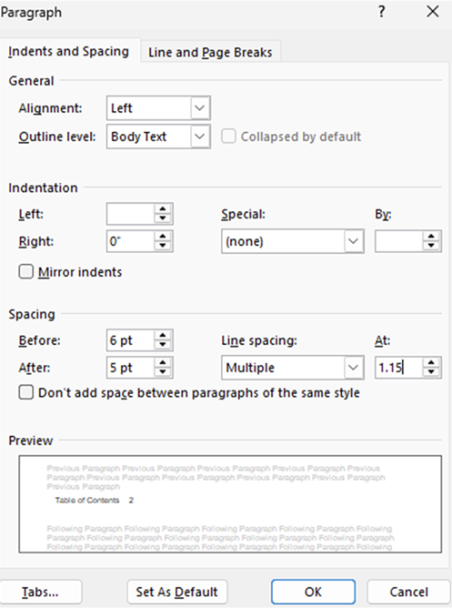
Example shows paragraph spacing added before (6 pt) and after (18 pt) of selected text.
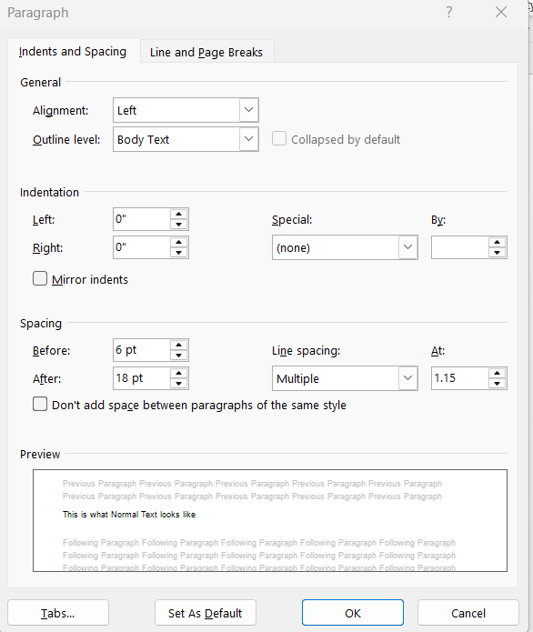
Table of Contents
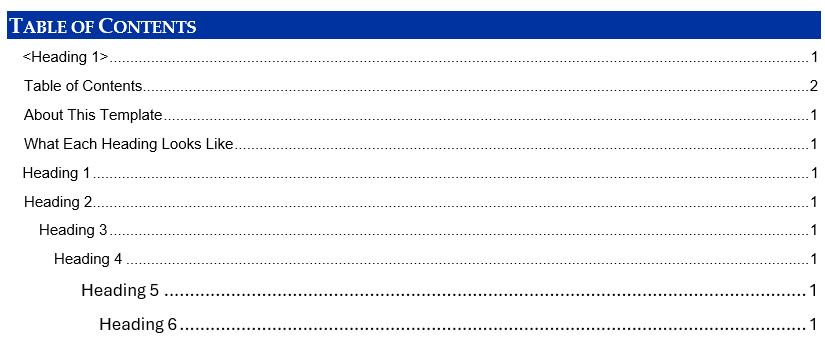
Important Note on the Table of Contents
- Due to the nature of using Heading1 differently than typical Word document formatting, you may notice items in your TOC that are unwanted. Delete these manually as needed.
- Word Table of Contents (TOC) do not inherit fonts from Heading styles; they use their own. When displaying TOC headings deeper than three levels, the user may need to manually modify the font and size of the TOC elements to adhere to document styling. Select all rows in the TOC and change to Arial, size 10, with a line spacing of “Multiple” and 1.15.
Example showing two possible changes to apply to the TOC: 1) delete the document title, on the first line 2) change Headings 5-6 to the same font and spacing as Headings 1-4.
Screenshot showing the paragraph formatting to apply to Headings 5-6.